Welcome. If you are on this page, you've noticed that RussianCases.com looks different from other educational websites. Our design is not a stylistic whim; it is a deliberate choice rooted in a powerful artistic and social philosophy: Russian Constructivism.
Born in the crucible of the Russian Revolution in the early 20th century, Constructivism was more than an art movement; it was a radical vision for the future. Artists like Vladimir Tatlin, Alexander Rodchenko, and El Lissitzky rejected the idea of "art for art's sake." They believed art had no place in the isolated studio, but belonged in the factory, on the street, and in the service of the people. Their goal was to use art as a tool to build a new, modern, and equitable society.
The Artist as Engineer
A central tenet of Constructivism was the re-imagining of the artist. No longer a painter with a brush, the artist was now an engineer with tools. They didn't compose paintings; they constructed objects. Their visual language was one of geometric abstraction, bold lines, and functional clarity.
This philosophy is the very soul of our website. We see the Russian language, particularly its complex case system, not as a painting to be passively admired, but as a structure to be actively built. The grammar has rules, components, and a logical system—much like an engineering blueprint. Our "Case Constructor" is your tool. You are not just a learner; you are a linguistic engineer, constructing meaning piece by piece.
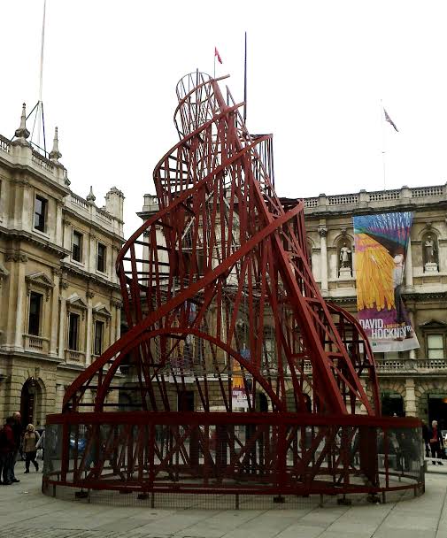
Vladimir Tatlin's "Monument to the Third International" (1919-20), an icon of Constructivist ambition, sought to merge art, architecture, and function.
Utilitarianism and Agitprop
The Constructivists believed art must be utilitarian—it must serve a practical purpose. Rodchenko and the poet Vladimir Mayakovsky became "advertising constructors," creating bold posters for state-owned stores that were designed to catch the eye and deliver a clear message. This form of "agitational propaganda," or "agitprop," used dynamic compositions and striking colors to communicate directly with the masses.
Our website embraces this spirit of purposeful design. Every element is here to serve your learning. The bold typography ensures clarity. The strong diagonal lines create a sense of dynamism and progress. The limited color palette focuses your attention on what's important. We are not here to merely decorate your screen; we are here to agitate your understanding and propel you towards fluency.
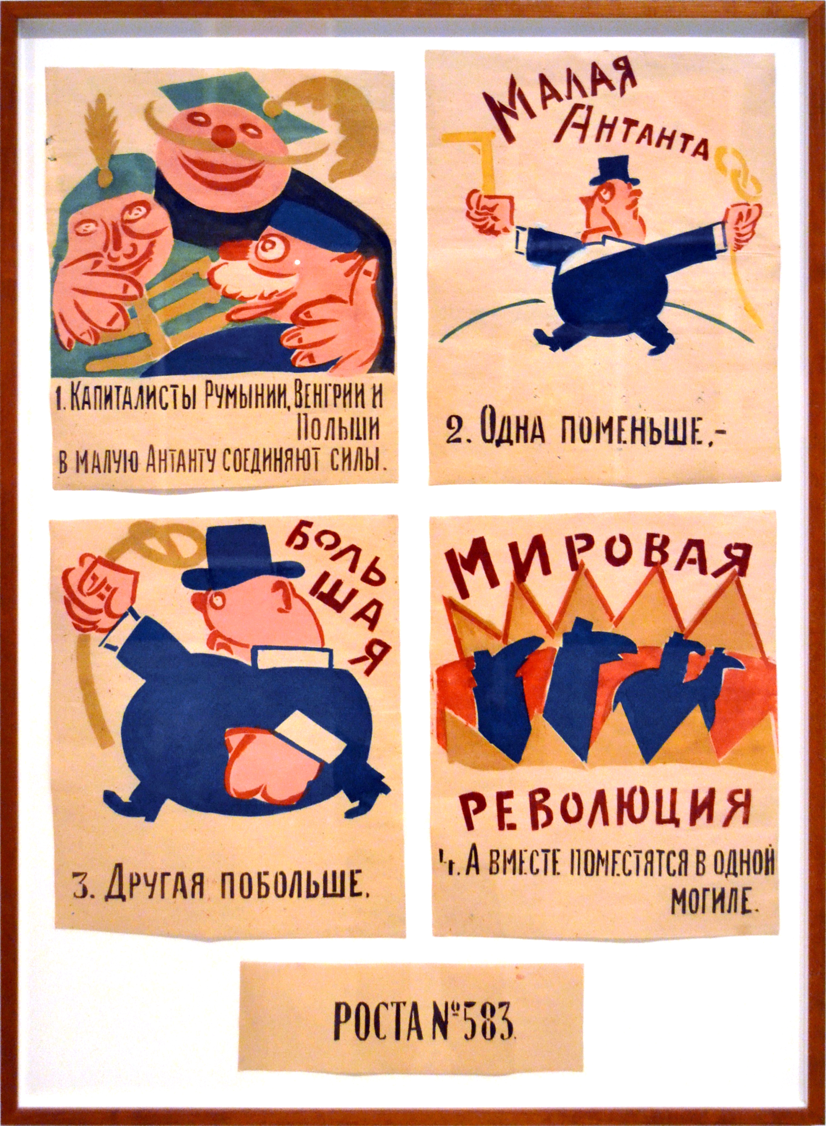
Constructivist posters used powerful visuals and typography to deliver messages with speed and impact, a principle we apply to delivering grammatical concepts.